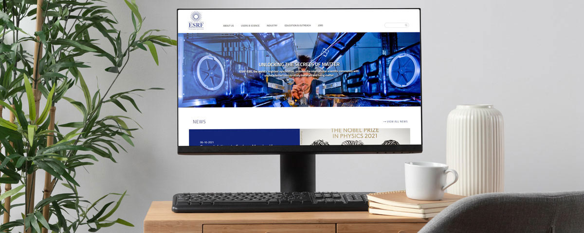
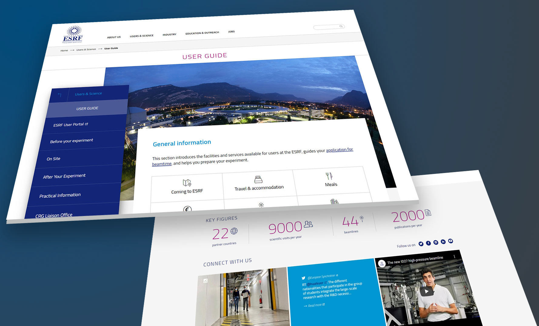
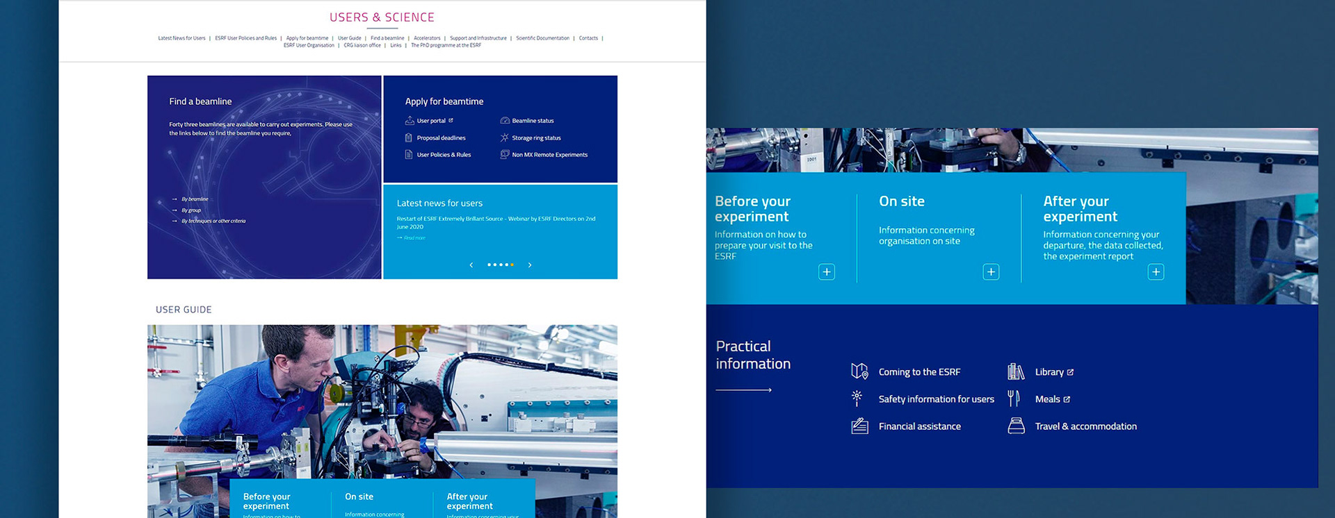
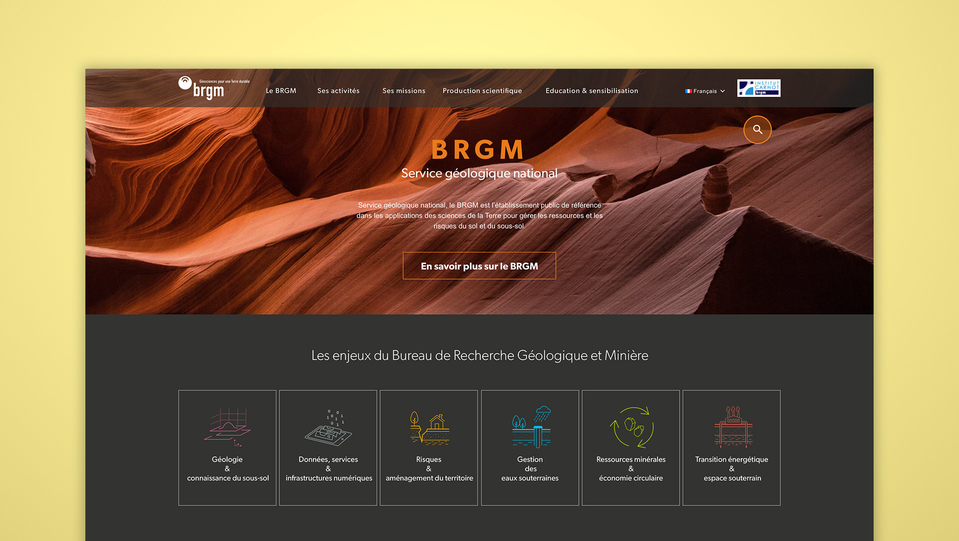
The ESRF is an open research institute. The institution manages one of the largest synchrotrons in the world, and offers research teams of all kinds access to this gigantic particle accelerator. The site makes it possible to promote the place, to welcome new teams, to allow the management of slots for tools. But it is also the archive element of all the publications related to the ESRF, so it allows you to follow the institute's news, and to access the previous results of the research carried out.
WHAT ?
Migrate the site to a more flexible technical infrastructure more suited to the size of the site. And take the opportunity to define a new graphic identity for the website
WHY ?
Previous website was an heavy and old technical structure needing to be updated for safety and usability reasons. The site was built gradually and no longer has homogeneity in the pages. It stands out by its obsolescence compared to other sites of institutes considered as competitors.
MY ROLE
My role was to rethink the artistic direction of the new website. Think of a stable and coherent graphic language throughout the very large number of pages (+15000). Easy to set up for development, but keeping a strong identity that sets the ESRF apart from nearby sites. The site has to be searchable on mobile, even if this was not the priority
HOW ?
Research phase with benchmarking of the various neighboring / concurrent sites
analysis with the client of the + and - of each site
brief specification, choice of colors, benchmark analysis results
production of models and monitoring / management of customer returns with invision
production of a design system to ensure the migration of the project to the teams of developers
analysis with the client of the + and - of each site
brief specification, choice of colors, benchmark analysis results
production of models and monitoring / management of customer returns with invision
production of a design system to ensure the migration of the project to the teams of developers
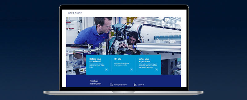
RESULTS
Website was launched as designed. It's currently stil in use and a mobile version has been developped following the rules primaly established.